
Update: This article made it to the front page of Hacker News. Comments here.
I’ve been working for the past few months on a side project called Cortado. It’s a website that helps to give you control over your daily information intake. You can create a personalized daily email with content from RSS feeds, email newsletters, Twitter, Reddit, Hacker News, and a growing list of additional sources. The goal is to put everything you need, and nothing more, in a single place that you already go to every day -- your email.
A month ago, when my user base was still just a few family members and friends, I decided it was time to get at least one user I didn’t already know. I posted about Cortado in a few forums, and eight people signed up. Not a big number, but it was exciting to have people I had no connection with using something I had built.
More importantly, I learned the hard way how important a carefully designed sign-up process is. I saw a large percentage of interested people fail to sign up because of easily preventable flaws in the flow. Two lessons in particular stand out:
- Don’t require a user to be interested twice
- Email verification messages should take two seconds to read
Lesson 1: Don’t require a user to be interested twice
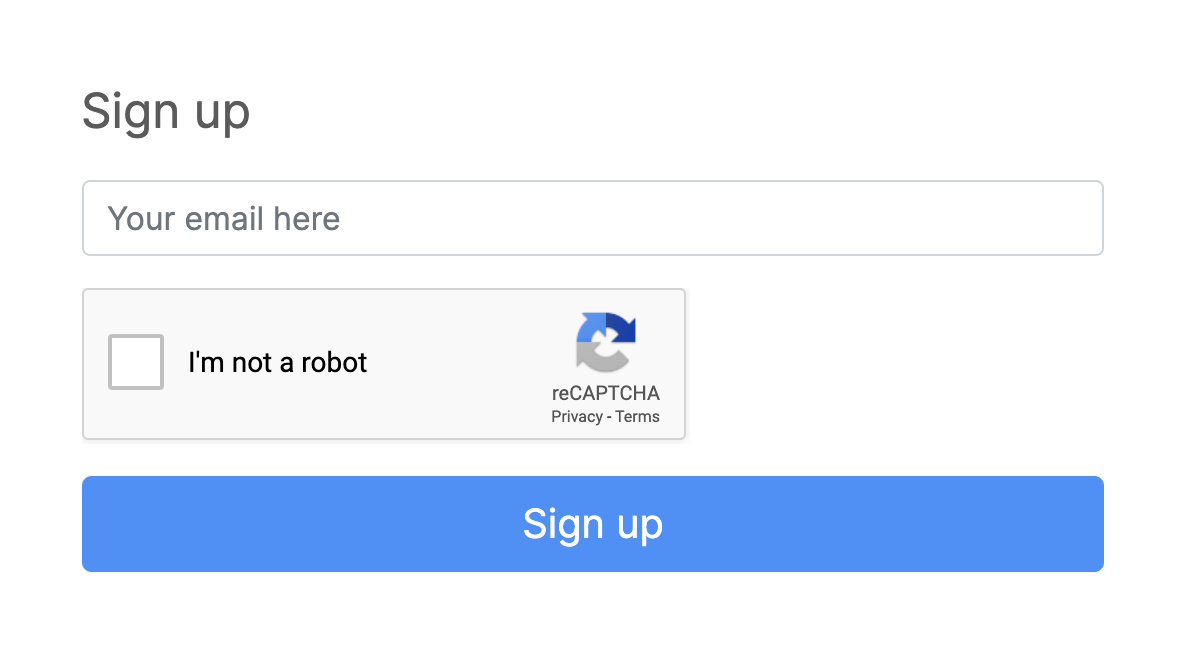
The sign-up section of my landing page used to look like this.
Users couldn’t get started on their own. They had to first leave their email address and then wait for me to send them an email with a link allowing them to register and start building their Cortado email.
My motivation was control. I was concerned about bots, and I was worried (unrealistically) that I’d get too many users too quickly. But a lot of people who left their email address didn’t actually register once they received the verification. After one of my posts climbed to the top of a small subreddit, 16 people signed up. I sent registration instructions to all of them within 8 hours, but only 6 people clicked the link in that email.
I had required people to be interested twice. First, they had to be interested enough to provide their email, and then they had to be interested enough to click through the verification message. Only 38% of people did this. If I had instead captured everyone as soon as they showed enough interest to leave an email address, I could’ve increased my conversion rate by 250%.
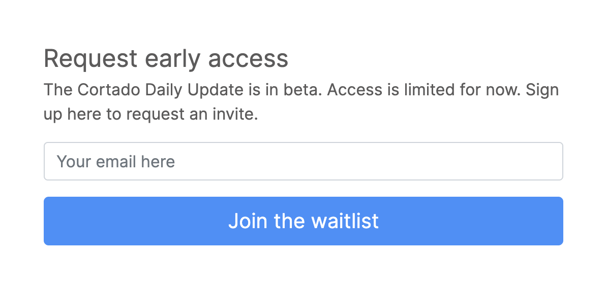
I’ve since decided that it’s better to have users than control. This is what the sign-up section looks like now.
As soon as users click the submit button, they get an email verification message in their inbox, which they can click on to set a password and get started. To retain some control, I put this permissive sign up flow behind a feature flag, and to help protect against bots, I added a reCAPTCHA. Now people only need to be interested once to sign up.
Lesson 2: Email verification messages should take two seconds to read
At first I didn’t put much thought into the content of the email verification message because it didn’t seem very complicated. All I needed was a secret link for users to click and instructions to click on it. What could go wrong? A lot, it turns out. Here is what the first version of my email looked like.
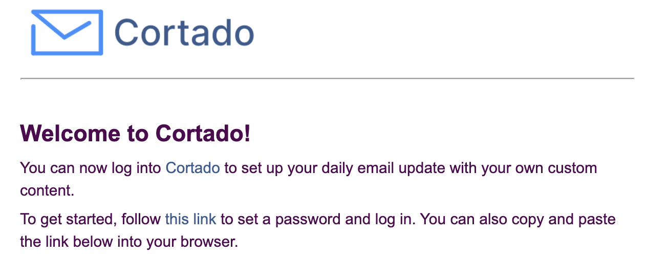
It seemed simple enough to me, but when I sent this email to a friend he clicked on the “Cortado” link in the first sentence. This sent him to the landing page instead of the sign-up page. He texted me saying my website didn’t work. I told him to try the other link, but it took him a couple of days to get to it and actually log in. If he wasn’t my friend, I would have lost a user.
My friend spent two seconds reading the message and clicked on the first link he saw. I do the same thing. So I removed the extra link in the next version of the message. (I also added a friendly sentence asking for feedback because, well, I wanted feedback.) Here is what the new message looked like.
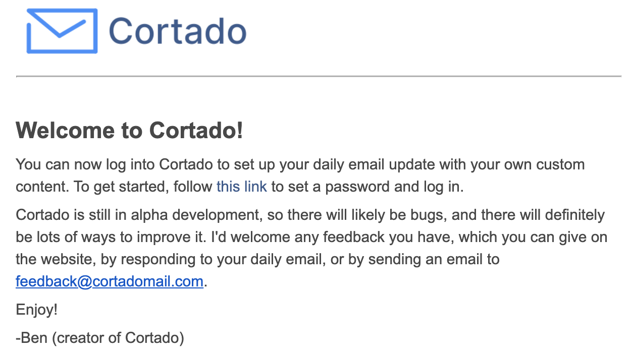
Now there was only one clickable link (not counting the one that’s obviously an email address). But there was still a problem: it was too hard to see. In fact, one user missed it entirely. After reading the email, he told me that there was no link. Totally understandable when you just spend two seconds reading. I was lucky that he emailed me. Most users would have just given up.
The fix was straightforward: make the link more obvious. Here is what the new version looks like.
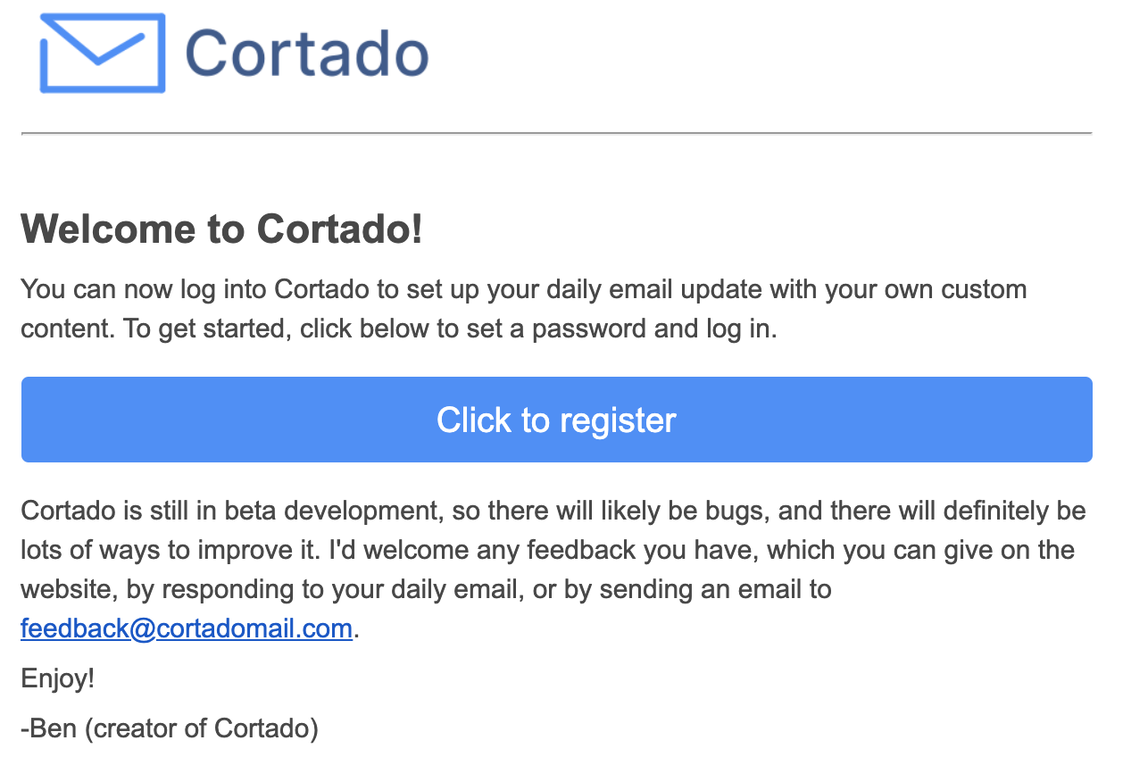
Much better, no? The thing you are supposed to do is the first thing you read. Hard to miss, even in two seconds.
Have my changes helped?
It seems so. After implementing them, I posted a link to Cortado in Hacker News. I didn’t hear about any problems with the sign-up flow this time around. And the numbers, while small and subject to sampling bias and other confounders (including some changes to my landing page), support this conclusion. About 50 people clicked on the Hacker News link, and 9 of those people registered, an 18% conversion rate. In contrast, it took me 120 clicks to get the 6 registrations from my last marketing effort, a 5% conversion rate.
I’m encouraged by this improvement, and I’m excited for what I’ll learn next in the quest to find new Cortado users.